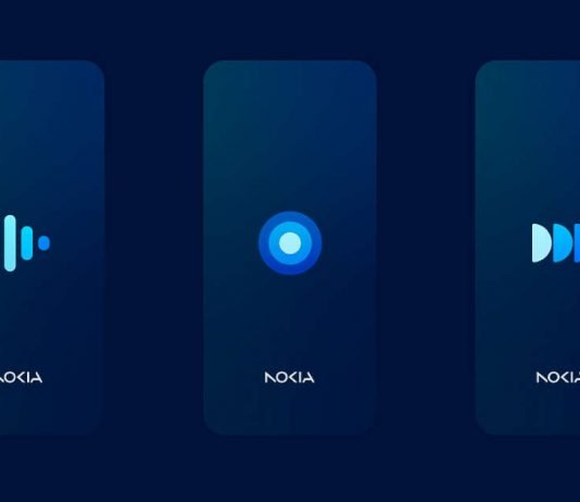
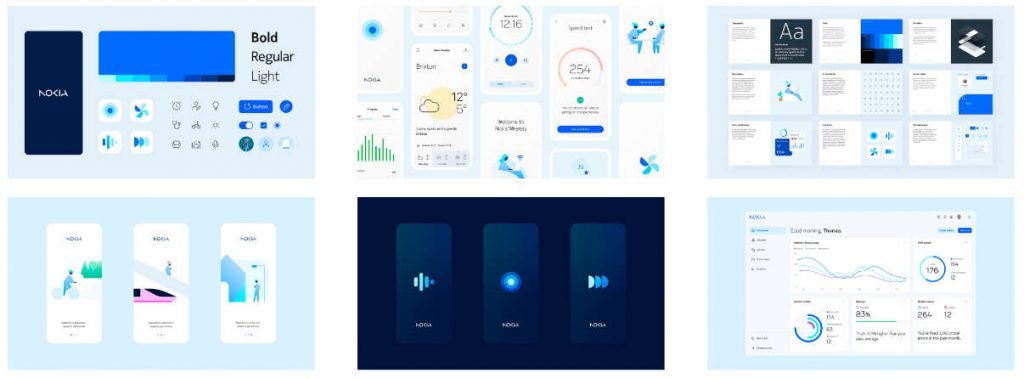
Nokia has unveiled its new interface, Pure, which will be the aesthetic and functional language for its upcoming smartphones and other devices like smartwatches, tablets, and PCs. The Nokia Design Team has created a flexible and future-proof interface that focuses on minimalism, with a few colours mainly based on shades of blue and the Nokia Pure font.
The icons of Nokia Pure UI feature smooth animations and vary in stroke thickness to improve visualization on different devices. Additionally, the UI offers a dark mode that helps reduce eye strain with a dark blue background instead of the traditional black.
Nokia has shared screenshots of Pure UI in action on smartwatches and computers, and it will be interesting to see which smartphone will be the first to come with this interface pre-installed. It remains to be seen whether an update will be released to bring it to existing Nokia devices.
According to Nokia, Pure UI is a clean and functional interface that embodies the company’s new direction as it returns to producing devices in Europe. While the company has not shared a specific release date for Pure UI, it has stated that it will arrive soon.
Overall, Pure UI represents a step forward for Nokia, as it seeks to offer a modern and sleek interface that can compete with the latest smartphone offerings from other companies. With its focus on minimalism and flexibility, Pure UI could be a significant selling point for Nokia’s devices in the coming years.

