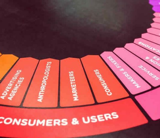
You’ve probably experienced a website that’s either hard to navigate or too slow, which can be frustrating. As a website developer or business owner, understand that a potential customer that’s frustrated with your site is more likely to leave it. Creating a user-friendly experience shouldn’t be understated because a proper design can turn potential on-lookers to customers. To create a better user experience, avoid the following.
Clunky or Dated Design
Any design that’s straight from the 90s falls under clunky or dated, but many companies choose this era as an aesthetic choice. For example, LingsCars is ugly and confusing, but Ling uses this to his advantage. If you don’t have Ling’s charisma, it’s better to stay away from flashy, overly aggressive design choices like” auto-play videos, omitting a search bar, too much color, hard to read text, GIFs as backgrounds, and/or graphics as text. The simpler, the better.
Forgetting Calls to Action
There’s an art to selling a product without coming off as too pushy. To avoid coming off as too salesy, many websites will avoid calls-to-action and hope their viewers will buy anyway. To create sales, you need a strong CTA on your landing pages, but many companies miss out on places they could be making a sale. Many UX agencies will stress the importance of creating original content through blogs, podcasts, or ebooks to convert readers instead of relying solely on ads or pop-ups because user-experience suffers.
Performance Issues
In 2010, a customer was 30% more likely to leave your website if the page took more than 4 seconds to load. In 2012, 40% of users would leave if a page took longer than 4 minutes. By 2016, 53% of websites are abandoned if they took over 3 seconds to load. It’s easy to forget how slow the Internet used to be, but users had to be more patient as a result. Now, any website that takes longer than 2 seconds to load is frustrating, and won’t hold user retention. Do what it takes to have a faster website, like reducing bulky code, using fewer graphics, and minimizing the design, so there is less to load on the screen.
Fooling Customers
Advertisements are normal on websites, but sometimes they interfere with where you click or navigation. For example, an ad that takes up a lot of real estate on the page is annoying enough, but when it loads after the rest of the page loads, it can cause you to click it by accident. This tactic is used to make others click on an ad, so the page owner gets a click-through bonus. Never use shady tactics like offering discounts on the front page but not at check-out, always advertising a minimum time discount (also illegal) or lying to your customers.
Broken or Inaccessible
It’s not your fault that someone else has slow Internet, but it’s common for people who live in rural areas to have less than a 3G connection speed. UX agencies usually encourage employees to test all products on slower connection speeds, regardless of how advanced a product may be to combat this issue. A potential customer may blame your website because of its inaccessibility, not their own Internet. Be prepared for this possibility by having as simple of a design as possible and work your way up after testing it on a slower connection.
