COVID-19 (Coronavirus) has been in the wild for the past couple of months terrorizing the whole world population. The good news is, the majority of victims of this deadly virus has been recovered and others are recovering., so don’t be panic.
At the time of writing — across the globe total confirmed cases has been listed as 113,808 and about 63,821 is totally recovered earlier and the death toll reaches 4,009.
Like me, if you are also concerned and like to track the spread of COVID-19 online — then there are some legit Coronavirus maps websites that show the effects of coronavirus in real-time — updating a master list of cases, deaths, and recoveries from across the globe.
Most of these Coronavirus maps use data from Johns Hopkins University’s Center for Systems Science and Engineering. The Coronavirus maps show the progress of COVID-19 as it moves around the world. The listed maps are intuitive to use and beautifully designed.
Contents
1. Johns Hopkins COVID-19 map
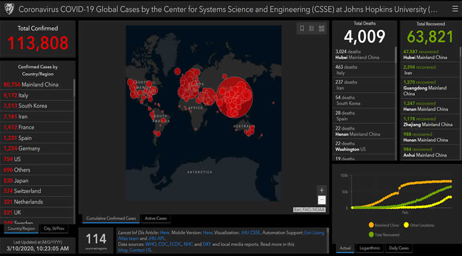
Coronavirus COVID-19 Global Cases map created by The Center for Systems Science and Engineering (CSSE) at Johns Hopkins University is the best and most precise Coronavirus map in the list to monitor the spread of COVID-19. The map shows the location and number of confirmed cases as they are reported, along with casualties and recoveries. There is also a mobile version available to follow the reports on the smartphone.
2. HealthMap
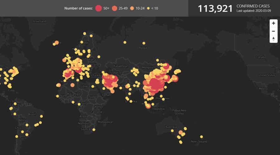
HealthMap — an online disease outbreak monitoring and real-time surveillance of emerging public health threats featured a visually pleasant animated Coronavirus map. The map fetches data from multiple sources and also shows an animated presentation of the spread of the virus from its start.
3. TheWuhanVirus
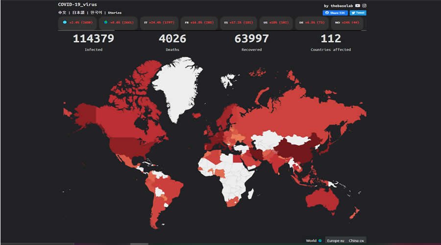
TheWuhanVirus website’s Coronavirus map updates at least 4 times a day with reports around the world. The map looks elegant and informative. The website also shows live news updates from around the globe about coronavirus.
4. World Health Organization’s COVID-19 dashboard
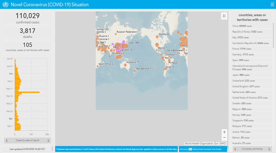
World Health Organization’s COVID-19 dashboard is simple compared to other Coronavirus maps. Reports show affected cases by date starting from January 22, 2020, with countries, areas or territories.
5. NextStrain
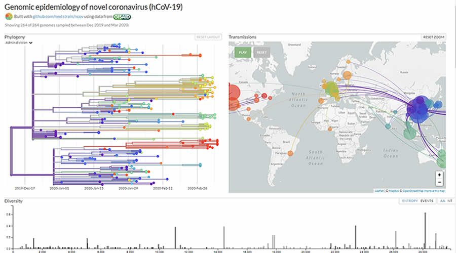
NextStrain COVID-19 map looks messy but displays a lot of information about the spread of disease. It breaks down the genome of the virus, alongside an animated map showing the routes by which it traveled from country to country.
6. The New York Times COVID-19 dashboard
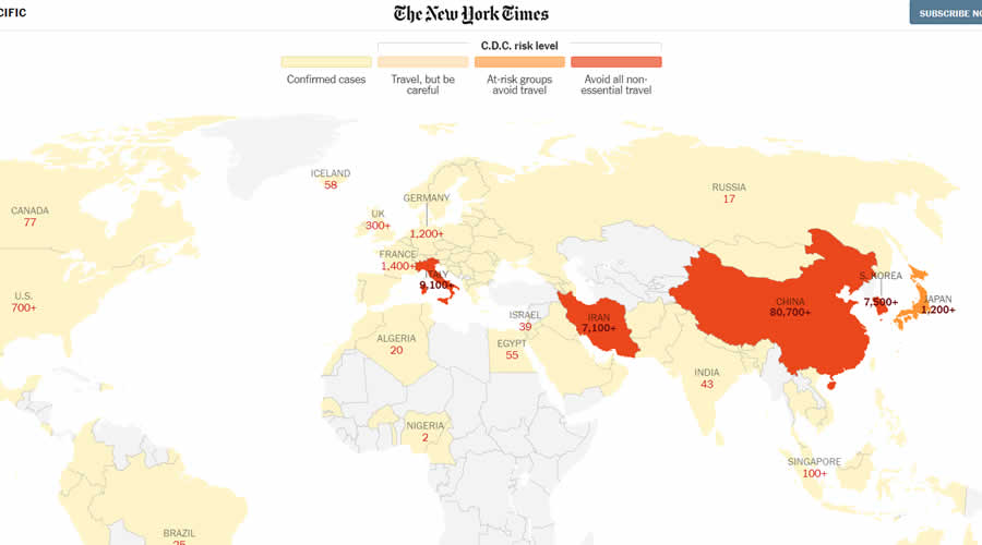
The New York Times also features a Coronavirus Map for tracking the spread of the outbreak. The dashboard displays both visual and text data to help you understand the current situation.
So these are some of the informative Coronavirus maps you should follow to monitor the spread of the outbreak. We request our readers to try to avoid crowds/public gatherings or any foreign trips. Also regularly and thoroughly clean your hands with an alcohol-based hand rub or wash them with soap and water and avoid touching eyes, nose and mouth. And if you have fever, cough and difficulty breathing, seek medical care early. Stay safe.

