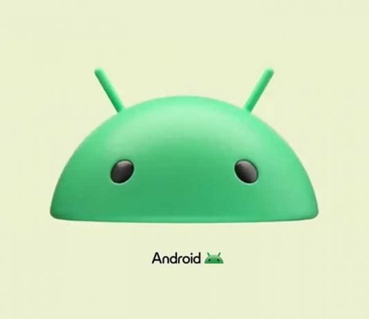
Android, the world’s most popular mobile operating system, has unveiled a revamped logo and wordmark. This is the first major rebranding exercise for Android since 2019, and it signifies a shift in the company’s design philosophy.
The new logo features a 3D version of the iconic Android robot head, a departure from the flat design that has been a staple of the logo for years. The 3D design gives the logo a more tangible and modern feel, reflecting the advancements in technology and the evolving user experience.
The wordmark has also undergone a transformation. For years, Android has been written entirely in lowercase. However, the new design introduces a capitalized “A”, marking a significant departure from the previous style. The font of the wordmark has been tweaked as well, with the ‘n’ and ‘r’ characters now perfectly rounded, harking back to the futuristic style of the 2008 and toned-down 2014 wordmarks.
The new logo and wordmark were first spotted at the CES 2023 and Google I/O 2023 events, where they were used in promotional materials. They have also been seen in an advertisement for Android’s first-party apps on the Samsung Galaxy S23 Ultra and Flip 4.
The new design is expected to gradually roll out across the Google ecosystem, and it’s likely that Android users will see it on the boot screen of their devices. The current branding appears as “Powered by Android,” but with the introduction of the new logo, this could change.
The shift to a 3D logo is particularly interesting, considering the recent collaboration between Google, Samsung, and Qualcomm on “XR” technology. This partnership hints at the possibility of a new Samsung VR headset that uses Google software, making the 3D logo a fitting representation of this new venture.
The rebranding is expected to coincide with the release of Android 14, scheduled for August 2023. This update will mark another milestone in Android’s journey, which has seen several logo changes since its launch in 2008.
