When it comes to unfolding an iOS project, it’s crucial to ensure that the resulting solution not only works like a dream but also looks eye-catching. As far as UX is concerned, it’s a truism that every single dollar put into it will ultimately bring back up to a hundredfold. In Forrester’s report, it’s also claimed that the product’s superb look and feel can elevate your client conversion rates up to 400%.
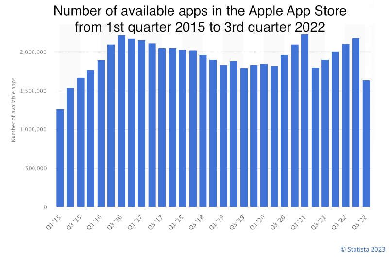
However, it’s not only the expectable profits that necessitate elaborating a professionally looking solution. As of the end of the last year, according to Statista, the number of apps in the Apple App Store topped an impressive 1.64 million. With such an intense rivalry, devising and implementing fresh iOS design ideas is no longer an option. Read the article to draw inspiration for your project and be able to successfully withstand competition.
Contents
What does it take to elaborate superb iOS app design?
Envisioning exceptional iOS design necessitates the mastery of proven techniques, top-notch technical skills, creative ideas, and user-centered thinking. If you don’t know where to start, look through the following fundamental points to consider when embarking on iOS app development:
- Ensuring seamless user experience so that your audience can effortlessly navigate your app, avail themselves of its functionality and layout, enjoy the interactivity of its features, etc.;
- Being in line with your firm’s overall style and making sure that chosen colors, fonts, tone of voice, and so on don’t stand out from the general concept and major ideas of your business;
- Tuning in to user feedback on the MVP stage when conducting user testing to better grasp the expectations of your target audience and revamp your iOS app design accordingly;
- Sticking to the Human Interface Guidelines (HIG) to devise visually appealing and convenient interfaces according to proven Apple standards;
- Covering accessibility features such as VoiceOver, Dynamic Type, and others, to allow individuals who are visual, auditory, or motor impaired, or those who have cognitive disabilities, to avail themselves of your app;
- Keeping your iOS app design simple and uncluttered, without unnecessary shadows, textures, and 3D elements, to reduce cognitive overload for the target audience and allow them to achieve their goals in no time and with minimal effort, as well as to ensure superior performance even on low-end devices.
Where to take creative iOS app design ideas from?
In other words, where to look for iOS app design inspiration? We recommend checking out the following sources to unleash your creativity:
- Dedicated blogs and websites on the subject, from Behance and Dribbble to Awwwards and Muzli, that set the fashion in the industry and address the latest iOS design trends;
- Competitor products from the leaders that set the bar in the industry; by taking a closer look at them, you’ll be able to cherry-pick successful ideas and come up with your own shticks to stand out of the pack;
- Current trends, styles, proven techniques, and best practices that never fail, e.g. minimalist interfaces, user-centered approach, Nielsen’s heuristics, a flat design approach, and more;
- Nature, being an eternal source of inspiration and original ideas with its perfect shapes, artfully matched colors, and recurring patterns;
- Art and culture, e.g. paintings, movies, animations, sculpture, architecture, fashion, and so on, that expand your perception of color combinations, shapes, typography, and overall aesthetic;
- Everyday objects, experiences, and observations that help you build a durable connection with your audience by envisioning interfaces that are familiar and easily recognizable, and thus, evoking nostalgia, comfort, excitement, and other emotions.
To sum up, iOS app design inspiration can come from a myriad of diverse sources; therefore, be open-minded and never cease keeping an eye out for novel ideas.
Envisioning compelling iOS design: fundamental principles and trends to follow
Below is a brief selection of proven guidelines to adhere to when working on iOS design:
Make a point of colors
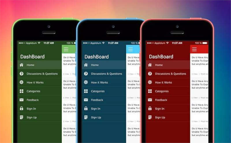
Colors are a cornerstone that drastically impacts the look and feel of your product. In line with HIG, it’s recommended to base your iOS app design ideas on the limited color selection that is present in your brand logo. Thus, you’ll maintain a consistent and recognizable brand identity throughout your app. Colors also serve to distinguish diverse UI elements and streamline navigation across them, e.g. applying tint colors to interactive elements, darker hues to the static ones, and red to error messages.
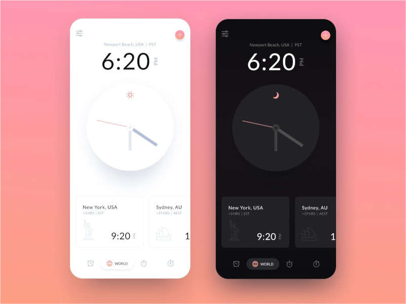
Another aspect to consider is the adaptability of your color group to light and dark appearances. The iOS system colors autotune to both; therefore, opting for them to solve some of your tasks will ensure consistency.
Reinforce your iOS design ideas with fonts
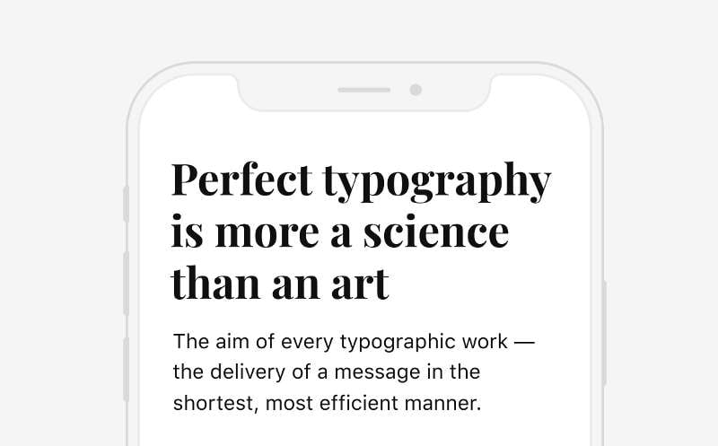
Well-matched typography will support your iOS app design ideas helping you convey your message. Turning to the two custom font styles, San Francisco and New York, is a common practice. These were crafted keeping the platform’s expandability and versatility in consideration. In addition, they are well-known by Apple fans; therefore, it’s preferable to employ them for paragraphs and functional texts, e.g. instructions and navigation. However, experimenting with other font styles can add a unique touch to your software.
Optimize elements for light and dark appearances
Applying your iOS design ideas to both light and dark appearances requires attentive consideration of several factors, including consistency, accessibility, and system settings on your users’ devices. Refrain from customizing these settings as, in this case, they’ll likely interfere with those on Apple devices. Furthermore, all icons, symbols, images, and text should be easily distinguishable, regardless of the type of appearance applied and increased or reduced brightness. To reach this effect, craft dedicated elements for both modes.
Follow touchscreen gestures best practices
Respecting Apple’s best practices for gesture-based navigation is essential when originating groundbreaking iOS app design ideas. Below is a brief extract from these guidelines to keep in mind:
- Adhere to general standards and consistency across different apps. Stick to common gestures that are familiar to your audience to enable standard actions and eliminate confusion. Fall back on tailor-fit gestures sparingly and only when necessary, e.g. to carry out actions that are exclusively crafted for your software.
- Provide shortcut gestures as an addition to standard gestures, not as their substitute, so that you offer expeditious access to features but grant your audience the possibility to stick with their habitual methods.
- Communicate the required gestures and their results to users. Ensure that they receive instantaneous feedback when performing an action, such as a visual or haptic response, as a confirmation that it has been successful.
- Gestures should serve to manipulate the relevant content, i.e. the very element that the person is addressing at the moment. If the piece of content fails to react to the action, involve higher content tiers and containers.
Use white space to get your ideas across
When it comes to creating an elegant iOS app design, the use of space can work for your benefit. White space alone can greatly enhance the aesthetic appeal of your app, balance elements, emphasize fundamental ideas, and outline a clear visual hierarchy. Refrain from leaving too much screen real estate for the logo. This can hinder the overall user experience, both in terms of content and navigation. Instead, there is an alternative method of reinforcing your brand such as applying a color scheme consistent with your brand to your iconography, text highlights, and even background or splash screens.
The key takeaways on envisioning compelling iOS design ideas
Generating stunning iOS app design ideas requires careful consideration and thought. By taking inspiration from various sources, following the HIG, and having your audience’s convenience in the first place, you’ll be able to envision interfaces that are both functional and aesthetically pleasing.
However, in pursuit of in-vogue iOS design trends, it’s crucial to keep in mind that creating an outstanding solution is a complex process. If you lack the time and resources to devote to the project, it will be rewarding to entrust it to professionals. Thus, you’ll get access to a source of inventive ideas, iOS app design inspiration, and top-notch expertise and unveil new perspectives in no time.
