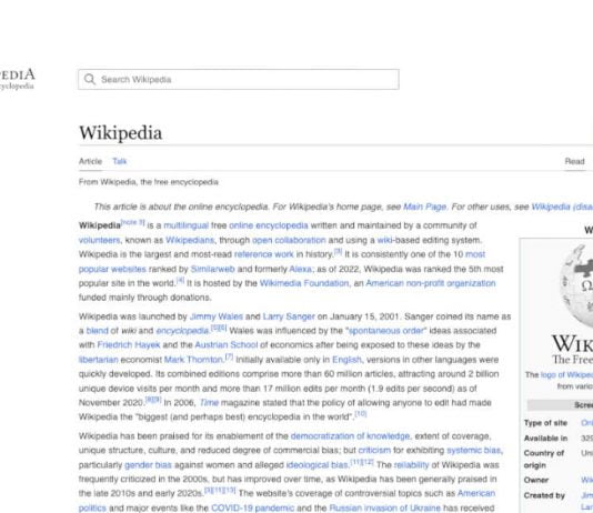
For the first time in almost a decade, Wikipedia, one of the world’s most popular websites, has undergone a major revamp. The Wikimedia Foundation oversaw the Wikipedia Project and stated that the new design would be more readable and user-friendly, with expanded search capabilities and language-switching options.
The new interface has been launched on 94% of Wikipedia’s 318 active language editions and is currently being rolled out to the English version. While some users may not notice the changes immediately, the Foundation claimed that the upgrade was required to fulfil the demands of the next generation of internet users, particularly younger and newer users.
Over 30 volunteer groups from across the world, including India, Indonesia, Ghana, and Argentina, helped design the new interface by testing updates and providing comments on product development. The update’s purpose was to “make Wikipedia a more contemporary online platform, reducing clutter while making it easier for people to contribute,” according to a press release. Another objective was to maintain uniformity between the desktop web version of Wikipedia and the mobile version.
One of the significant changes is a newly updated search box that combines photos and descriptions as autocomplete recommendations to help readers to the articles they seek. According to the Wikimedia Foundation, this and other changes have resulted in a 30% increase in user searches. Furthermore, the language switcher has been relocated to a more prominent area in the upper right corner, allowing readers and editors to choose from over 300 supported languages. This is especially important in emerging markets, where multilingual users may need to access websites written in various languages.
A new index area on the left side of articles helps visitors explore larger pieces of material and remains visible as they scroll down the page. As they investigate a topic, they may move between different sections of the article effortlessly.
Other improvements include the addition of a collapsible sidebar to increase readability, adjusting the maximum line width, and raising the default font size. The Foundation also stated that restricting the breadth of lengthy sentences enhances the reading experience and content retention.
Given Wikipedia’s large audience, it’s evident that the organisation avoided making drastic changes. The website presently has over 58 million articles in over 300 languages and is accessed about 16 billion times monthly. According to the Foundation, this upgrade did not eliminate any current functionality but focused on increasing usability and updating the site.
Overall, Wikipedia’s makeover is a great step forward for the website and visitors. The redesigned UI is more contemporary and user-friendly, with expanded language-switching features and improved search capabilities. It is important to remember that Wikipedia is a non-profit organisation as it continues to expand and adapt to the changing demands of its users.


