Home Blog Page 399

Google With MIT Developed A New Algorithm To Remove The Window Reflection From Your Photos

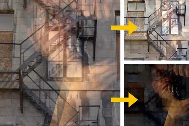
Researchers at MIT have developed an algorithm that can automatically separate window reflections from a digital image (left) and remove them (top right). Credit: MIT

We have all tried to take a picture through a window of a gorgeous view, only to have our own mug reflected back in the photo.Photographers are often stymied by their own reflection or that of their camera when shooting through glass, but researchers at MIT and Google Research have developed new software that has the ability to remove reflections, dust, and raindrops that make their way into your pictures.

The algorithm, building on work done by Daniel Zoran and Yair Weiss of the Hebrew University of Jerusalem, divides images into 8-by-8 blocks of pixels and determines each pixel’s correlation with another. Their technique is able to identify which minuscule sections of the photo are part of the reflection and which are the actual image seen behind the glass.

The researchers in a video explaining the technology behind the software said that:
“ Photographers are often forced to take images through obstructing elements ,” said the researchers in a video explaining the technology behind the software. “ For instance when taking images through a glass window, reflections from indoor objects often obstruct the scene we wish to capture. Our algorithm automatically decomposes the sequence of images into a background and reflection component to produce a new clean image where the reflection has been removed.
Similarly when photographing a scene thought a fence we would like to remove the occluding fence from our image.Again our algorithm is able to decompose the sequence into the background and foreground to produce the desired de-fenced image.”Sadly we’ll be waiting quite a while however, as currently photos are being processed by a beefy eight-core Intel Xeon CPU and 64GB of RAM.”

A non-optimised implementation takes around 20 minutes, while a low-resolution photo being analysed by a Windows Phone prototype app takes two minutes.
The researchers will be presenting their paper at the Siggraph computer graphics and interaction conference in Los Angeles later this month.

See the video to get more information:

Add Sticky Note Effect In Your Websites Using HTML And CSS

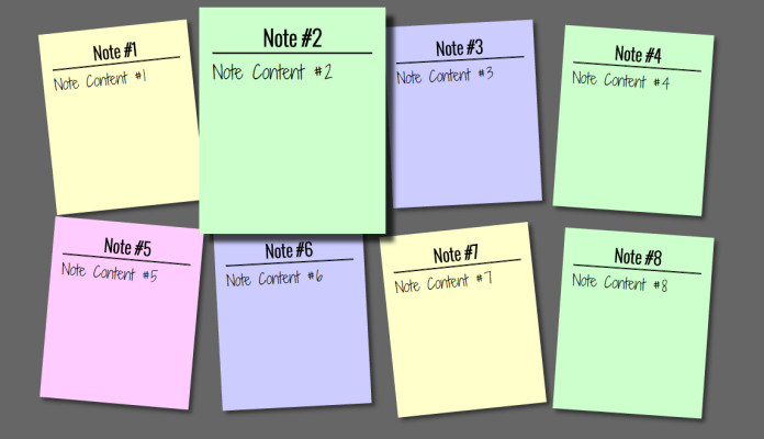
sticky note effect using html and css
In this tutorial we will show you how to add a sticky note effect in your website.Here we are using only HTML and CSS to create this effect.Will work finely in Firefox, Opera, Safari and Chrome.By clever use of the nth-child selector and CSS transformations and transitions, we saved ourselves some scripting.And Google’s Web Font API made it easy to use a custom font. Check out the demo.
STICKY NOTES EFFECT DEMO

►CSS


First copy and paste below CSS code above </head> .tag.

<link href='http://fonts.googleapis.com/css?family=Oswald:300' rel='stylesheet' type='text/css'>
<link href='http://fonts.googleapis.com/css?family=Shadows+Into+Light+Two' rel='stylesheet' type='text/css'>
<style>
.snote{
max-width:100%;
background-color:#666;
}

.snote h2,p{
  font-size:100%;
  font-weight:normal;
}

.snote ul,li{
  list-style:none;
}

.snote ul{
  overflow:hidden;
  padding:3em;
}

.snote ul li a{
  text-decoration:none;
  color:#000;
  background:#ffc;
  display:block;
  height:15em;
  width:12em;
  padding:1em;
  -moz-box-shadow:5px 5px 7px rgba(33,33,33,1);
  -webkit-box-shadow: 5px 5px 7px rgba(33,33,33,.7);
   box-shadow: 5px 5px 7px rgba(33,33,33,.7);
  -webkit-transform:rotate(-6deg);
  -o-transform:rotate(-6deg);
  -moz-transform:rotate(-6deg);
  -moz-transition:-moz-transform .15s linear;
  -o-transition:-o-transform .15s linear;
  -webkit-transition:-webkit-transform .15s linear;
}

.snote ul li:nth-child(even) a{
  -o-transform:rotate(4deg);
  -webkit-transform:rotate(4deg);
  -moz-transform:rotate(4deg);
   position:relative;
  top:5px;
  background:#cfc;
}

.snote ul li:nth-child(3n) a{
  -o-transform:rotate(-3deg);
  -webkit-transform:rotate(-3deg);
  -moz-transform:rotate(-3deg);
  position:relative;
  top:-5px;
  background:#ccf;
}

.snote ul li:nth-child(5n) a{
  -o-transform:rotate(5deg);
  -webkit-transform:rotate(5deg);
  -moz-transform:rotate(5deg);
  position:relative;
  top:-10px;
  background:#fcf;
}

.snote ul li a:hover,ul li a:focus{
  -moz-box-shadow:10px 10px 7px rgba(0,0,0,.7);
  -webkit-box-shadow: 10px 10px 7px rgba(0,0,0,.7);
  box-shadow:10px 10px 7px rgba(0,0,0,.7);
  -webkit-transform: scale(1.25);
  -moz-transform: scale(1.25);
  -o-transform: scale(1.25);
  position:relative;
  z-index:5;
}

.snote ul li{
  margin:1em;
  float:left;
}

.snote ul li h2{
  font-size:160%;
  font-weight:bold;
  padding-bottom:0px;
  font-family:Oswald;
  text-align:center;
  color:#000;
}

.snote ul li p{
  font-family:'Shadows Into Light Two',arial,sans-serif;
  font-size:140%;
  color:#000;
}
</style>

►HTML


Now its time for body.Copy and paste below HTML  Code to the place where you want to display Sticky Note.

<div class="snote">
<ul>
  <li>
    <a href="#LINK 1">
      <h2>Note #1</h2><hr />
      <p>Note Content #1</p>
    </a>
  </li>
  <li>
    <a href="#LINK 2">
      <h2>Note #2</h2><hr />
      <p>Note Content #2</p>
    </a>
  </li>
  <li>
    <a href="#LINK 3">
      <h2>Note  #3</h2><hr />
      <p>Note Content #3</p>
    </a>
  </li>
  <li>
    <a href="#LINK 4">
      <h2>Note #4</h2><hr />
      <p>Note Content #4</p>
    </a>
  </li>
  <li>
    <a href="#LINK 5">
      <h2>Note #5</h2><hr />
      <p>Note Content #5</p>
    </a>
  </li>
</ul>
</div>

Replace LINK,NOTE,NOTE CONTENT with link of the note,heading of  the note and content of the note respectively.You can add any number of sticky note .
And we are done,Here is our smooth animated pure html and css sticky note effect.Any doubts comment below.

How To Remove $RECYCLE.BIN,System Volume Information and desktop.ini Files From Your PC/Laptop

remove recycle bin-desktop.ini
 Ho no,my system is infected by virus because each folder in my drive displays $RECYCLE.BIN,System Volume Information and desktop.ini files and the worst thing is they are undeletable.These problem commonly occur in windows.Friends actually these files are not viruses,they are operating system files.They will display in each and every folder of drives and other external drives which is connected to your PC/Laptop.Since they are system files,so it’s undeleteable.But we can hide them by editing our folder options.So today we will show you how to hide them.
Step 1:
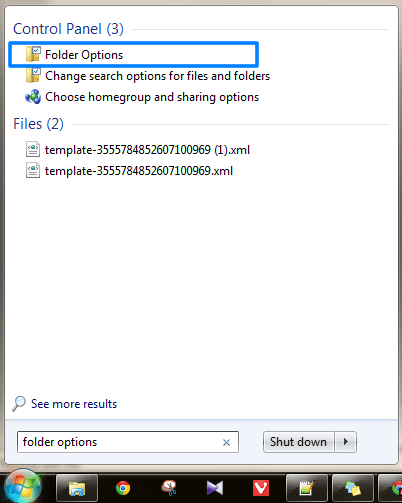
So first go to “Start → Search” and type “Folder Options
How To Remove $RECYCLE.BIN,System Volume Information and desktop.ini Files From Your PC/Laptop

Step 2:

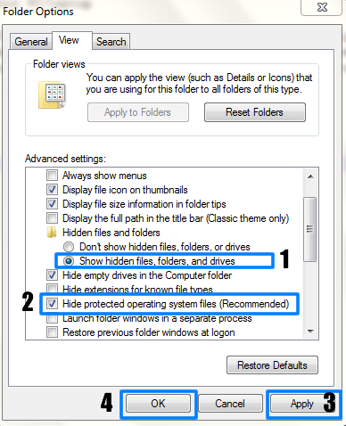
 Then in “Folder Options” click “View” option and edit settings like below image:
How To Remove $RECYCLE.BIN,System Volume Information and desktop.ini Files From Your PC/Laptop

And that’s it “TickingHide protected operating system files will hide $RECYCLE.BIN,System Volume Information and desktop.ini Files From Your PC/Laptop.So now onwards don’t afraid of these deadly viruses.. 🙂

Create A Photo Collage Polaroid Effect To An Image Using Photoshop

In this tutorial, we are going to show you how to create a photo collage polaroid effect to an image using Photoshop. That how to turn a single photograph into a collage of polaroids, with each polaroid containing a small section of the overall image.
 
Creating a photo collage now becomes one of the easiest photo manipulation options for everyone as a couple of offline and online collage maker apps and software are available for both PC and smartphones. If you are looking for such a collage maker, then try Adobe Spark Post to take photo collage to the next level with multimedia elements. With Adobe Spark, you can enhance your collage by adding stickers, icons, and eye-catching colors and make it a simple collage or an attention-grabbing one.
 
It may look complicated at first but it is one of the easy photo effects that we can make in Photoshop. With this tutorial, you will also understand grouping layers.
 
Tutorial Details:
Difficulty : Intermediate
Estimated Time : 30 Minutes
Software : Photoshop Cs5 +
 

Photo Collage Polaroid Effect To An Image Using Photoshop

Step 1:

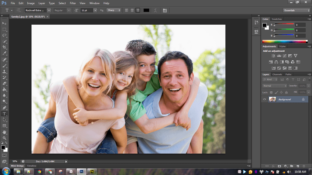
Open your image using Photoshop.

Create A Photo Collage Effect To An Image Using PhotoshopStep 2:

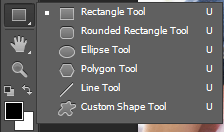
Now we are going to create our first polaroid. So select “Rectangle Tool” from Tool Panel.

Create A Photo Collage Effect To An Image Using PhotoshopStep 3:

Set the Tool Mode option on the far left of the Options Bar to “Shape” and “Fill” to “Black” color and “Stroke” to “None” like below screenshot:

Create A Photo Collage Effect To An Image Using PhotoshopStep 4:

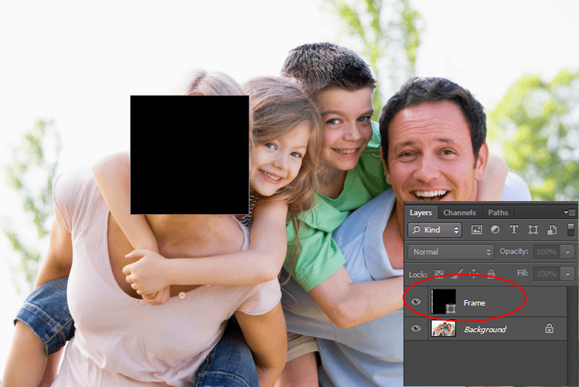
Now Press and Hold the Shift Key on your keyboard, then click and drag out your shape. Holding Shift Key while dragging will helps you to draw a perfect square shape. But make sure you release your mouse button before releasing the Shift key otherwise it won’t work. Now you will get a black square shape on your image. Rename your shape layer as “Frame”.

Create A Photo Collage Effect To An Image Using PhotoshopStep 5:

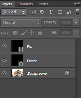
Duplicate “Frame” layer by pressing “Ctrl+J ” and rename new layer as “Pic”

Create A Photo Collage Effect To An Image Using PhotoshopStep 6:

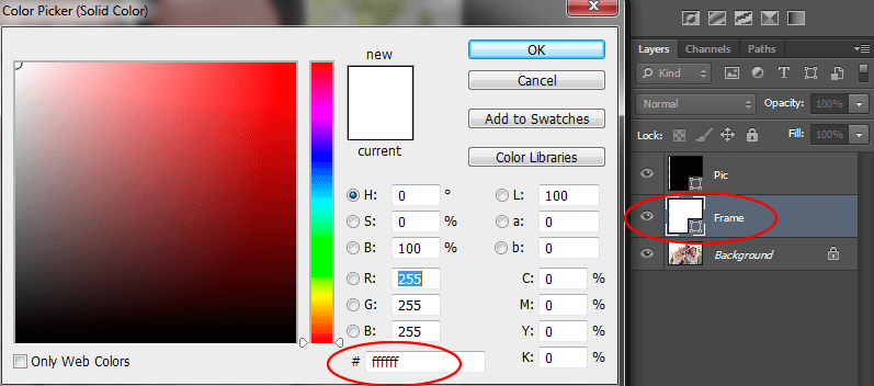
Now select the “Frame” Layer and change its color to “White“.

Create A Photo Collage Effect To An Image Using PhotoshopStep 7:

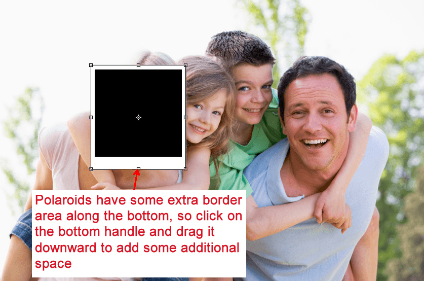
Again select “Frame” Layer and press “Ctrl+T” to Free Transform your shape. Give some extra space for bottom-border, because polaroids have it. And you will get something similar to this.

Create A Photo Collage Effect To An Image Using PhotoshopStep 8:

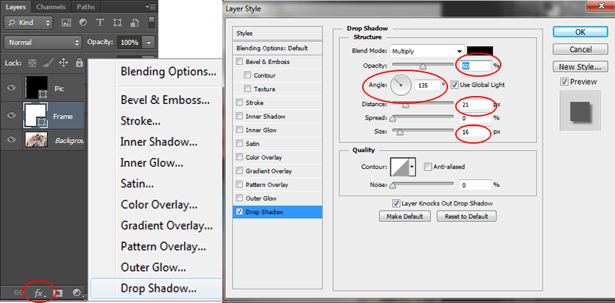
So let’s give some shadow effect to our “Frame” Layer . So choose it again and press “Layer Style” button below the layer panel and choose “Drop Shadow” and set values like below screenshot.

Create A Photo Collage Effect To An Image Using PhotoshopStep 9:

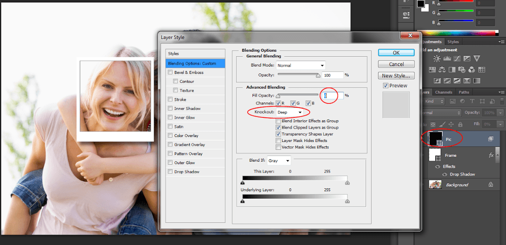
Now double click on the “Pic” layer and you will get a new window called “Layer Style” (Or Right Click the “Pic” Layer and choose “Blending Options”). And set values like below screenshot.

Yes and you got your first polaroid with white frame.

Create A Photo Collage Effect To An Image Using PhotoshopStep 10:

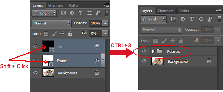
Hold Shift Key and select “Pic” and “Frame” Layers and then press “Ctrl+G” to group them. Rename the group as “Polaroid”

Create A Photo Collage Effect To An Image Using PhotoshopStep 11:

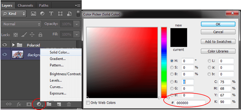
Now we are going to add more polaroids. Before that we have to hide our “Background” layer with a Solid color. So choose “Background” Layer and click “New Fill or Adjustment Layer” button on the bottom of the layer panel and choose “Solid Color” from the top of the list that appears.

Here am filling it with Black color you can choose any Solid Color.

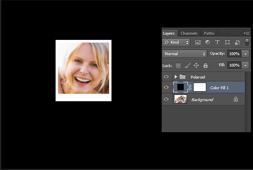
Create A Photo Collage Effect To An Image Using PhotoshopAnd your image will look like below one.

Create A Photo Collage Effect To An Image Using PhotoshopStep 12:

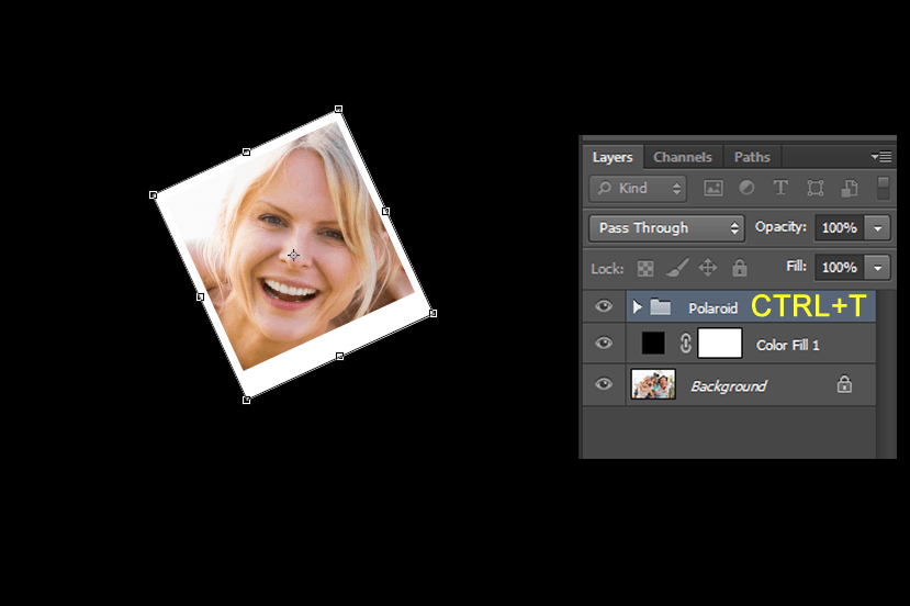
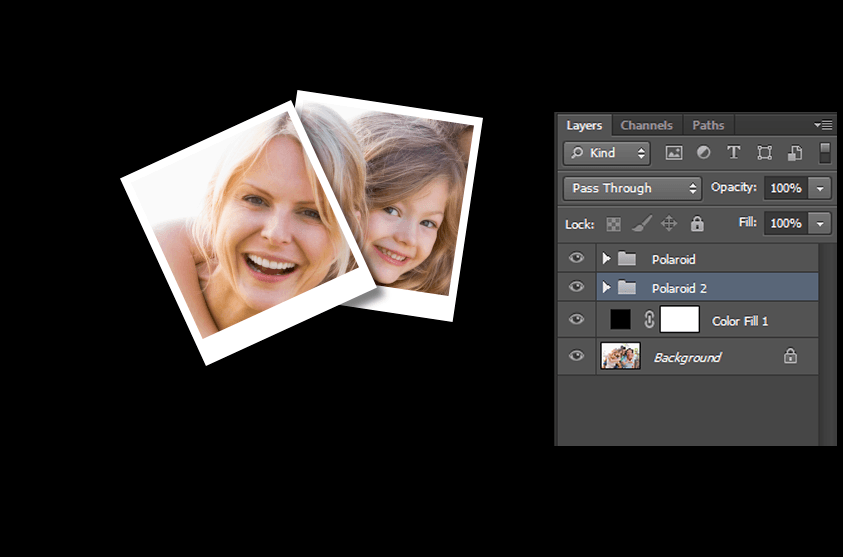
Let’s give some visual effect to polaroid. Select “Polaroid” Group and press “Ctrl+T” and rotate in some angle as you like.

Create A Photo Collage Effect To An Image Using PhotoshopStep 13:

Now we are going to create more polaroids. So Copy “Polaroid” Group by pressing “Ctrl+J” and move to some other location and rotate it like we did in Step 12.

Create A Photo Collage Effect To An Image Using PhotoshopStep 14:

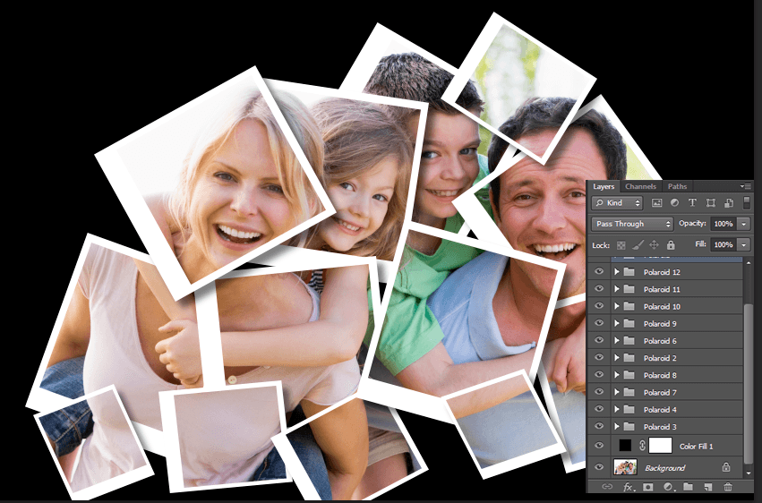
Repeat the Step 13 to create more polaroids and arrange the groups my moving up and down.

Create A Photo Collage Effect To An Image Using PhotoshopStep 15:

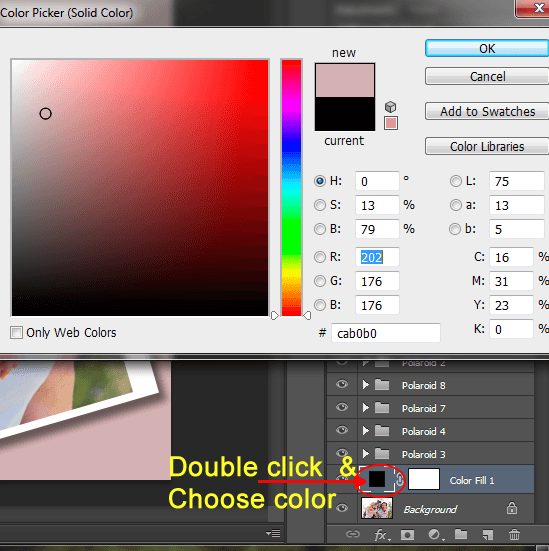
This step is optional, only do if you want to change the background color with something similar to image. Choose Filled layer and double click on solid color thumbnail and set desired color you want.

Create A Photo Collage Effect To An Image Using PhotoshopFinal Image

Create A Photo Collage Effect To An Image Using Photoshop
 

That’s it! I hope you all enjoyed this tutorial and if you have any doubts feel free to comment

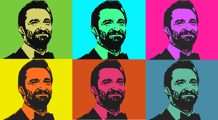
Create A Serigraph Effect To Images In Photoshop

photoshop photo manipulation tutorial
Serigraphy is a printing process that forces ink through a fine mesh screen or stencil. In this tutorial we going to show you how to apply a serigraph effect to you image using photoshop.This is a very simple tutorial.With the help of “Stamp” filter and “Hue/Saturation” we can get this effect.So lets start.
Tutorial Details

Difficulty : Beginner
Estimated Time : 10 Minutes
Software : Photoshop Cs3 +


►Step 1


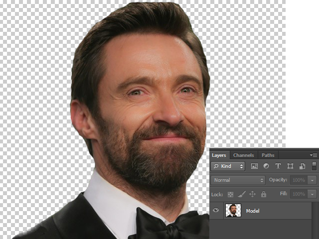
Open your image in photoshop.Remove its background with the help of Lasso Tool or Eraser Tool or by Layer Mask.
Now we will have a image with transparent background and name the layer as “Model

Remove its background with the help of Lasso Tool or Eraser Tool or by Layer Mask.

►Step 2


Now “Desaturate” your image by pressing “Ctrl + Shift + U” or go to “Image → Adjustments → Desaturate“.

Desaturate your image by pressing Ctrl + Shift + U

►Step 3


• Press “D” set Foreground and Background Colors to Default.
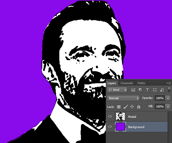
• Then go to go to “Filter → Sketch → Stamp” to apply “Stamp” filter and set values like below.

Apply stamp filter in photoshop

►Step 4


Create a new layer below “Model” and fill it with any color.Name the layer as “Background

create new layer and fill it with any color in photoshop

►Step 5


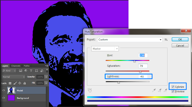
• Next Focus “Model” layer.And we are going to apply “Hue/Saturation” effect to it.
• So press “Ctrl + U” .
• First tick “Colorize” option and set “Lightness” to “-40“.You can set “Hue” and “Saturation” with your desired values.

apply hue and saturation in photoshop

With the above step we successfully applied Serigraph effect to our image.
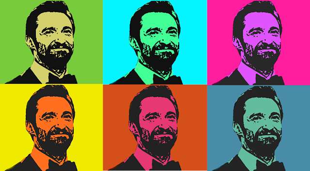
If you like to add different colors to your image.Just “Merge” the two layers and then apply “Hue/Saturation” again and again.then you will get different colorful images.


  Final Image


Create A Serigraph Effect To Images In Photoshop

Create A Suspended Text Effect Using Photoshop

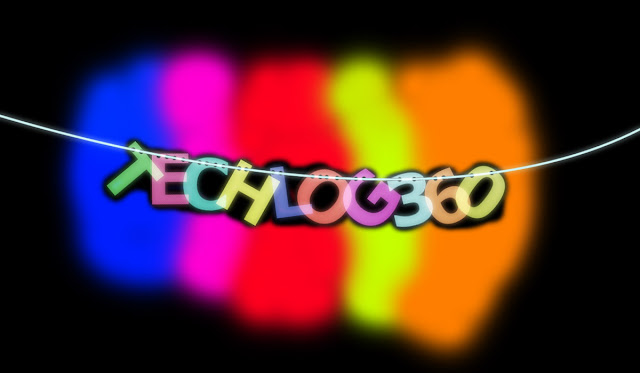
suspended text effect

In this tutorial we are going to show you how to create a suspended text effect in photoshop.The tutorial will show you how to create a path using pen tool and how to select and edit a particular item from the document.
Reference:PhotoshopStar
So let’s start:

Tutorial Details

Difficulty : Intermediate
Estimated Time : 45 Minutes
Software : Photoshop Cs3 +


►Step 1


• Create a new document “(1000 X 700)px” with black background color.
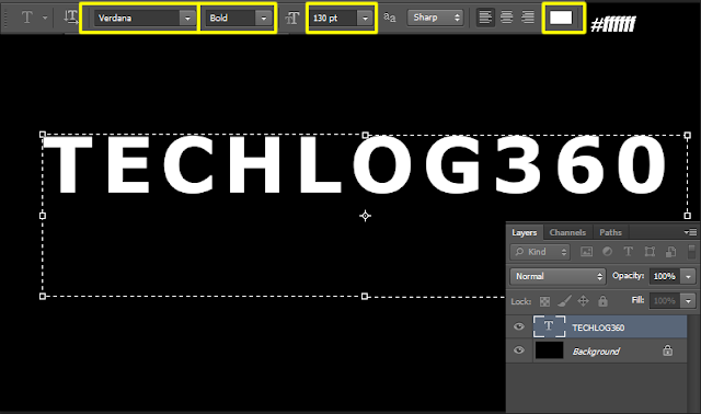
• And create a new Text layer with following properties:
Font : Verdana
Font Style: Bold
Font Size:130pt
Font Color:#ffffff

create a text using text tool in photoshop

►Step 2


• Now create a new layer above “Background” and name it as “Gradient“.
• Select Gradient Tool and set foreground color #ffffff(white) and background color #000000(black) and gradient style “Linear Gradient
• Now drag a line from top to bottom to create a gradient effect

use of gradient tool in photoshop

►Step 3


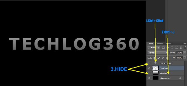
• “Ctrl + Click” on text layer thumbnail.Now you can see a selection around your letters.
• Now focus on “Gradient” layer and press “Ctrl + J” to duplicate it.And name the new layer as “TextGrad
• And Hide Text layer and “Gradient” layer.
Now you can see gradient is applied on your text only.

duplicate layers in photoshop

►Step 4


Now we are going to select each letters of our text.
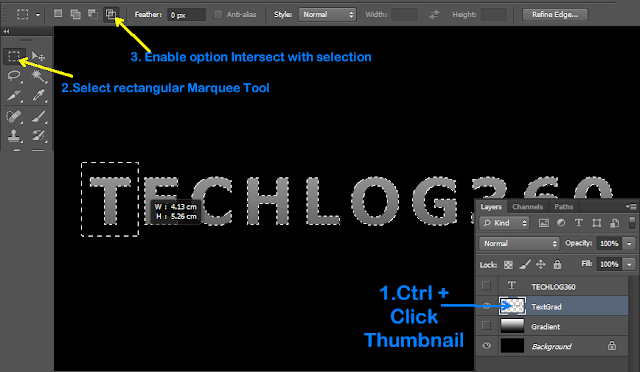
• Focus on “TextGrad” layer.
• “Ctrl + Click” on “TextGrad” layer thumbnail.
• Then select “Rectangular Marquee Tool” and enable option “Intersect With Selection“.
• And select your first letter.

use of rectangular marquee tool in photoshop

Now you can see only you first letter is selected.

select an item in photoshop

►Step 5


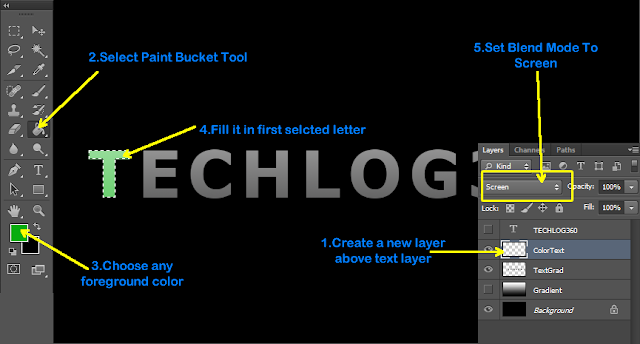
• Create a new layer above “TextGrad” and name it as “ColorText“.
• Now focus on “ColorText” layer and select any color and using “Paint Bucket Tool” fill our first selected text.
• Set Blend Mode to “Screen“.
• And last press “Ctrl + D” to deselect

fill color and change blend mode in photoshop

►Step 6


Repeat above two steps to edit your reaming letters and you will get an image similar to below one

fill color using photoshop

►Step 7


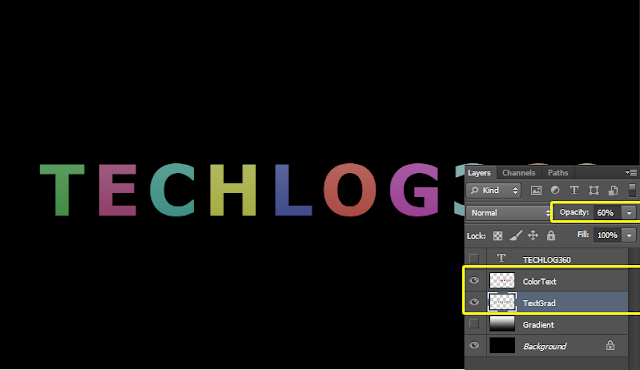
Set Opacity of both “TextGrad” and “ColorText” layers to “60%

set opacity in photoshop

►Step 8


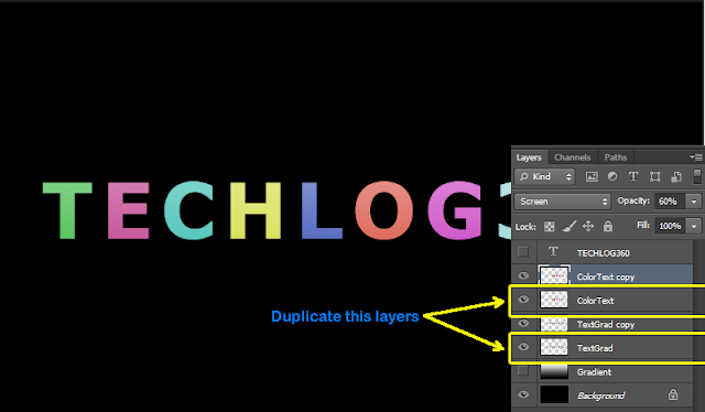
Now duplicateTextGrad” and “ColorText” layers.

duplicate layers in photoshop

►Step 9


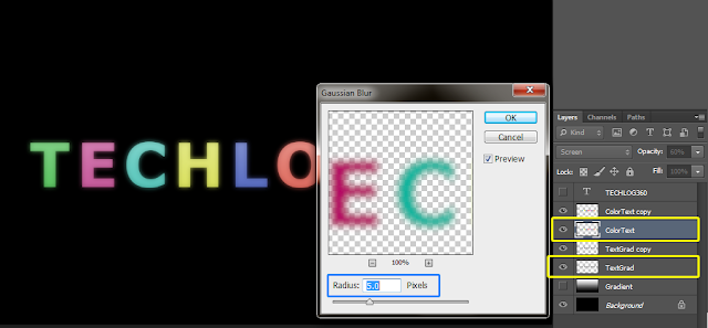
• First focus on original “TextGrad” layer and go to “Filter → Blur → Gaussian Blur” and set “Radius:5px“.
• Do the same effect to original “ColorText” layer too.

Apply gaussian blur effect in photoshop

►Step 10


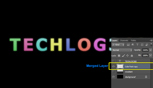
Now merge all those four layers [“ColorText,ColorText Copy,TextGrad Copy,TextGrad”].
To Merge,”Ctrl + Clickeach layer and go to “Layers → Merge Layers” or press “Ctrl + E

merge layers in photoshop

►Step 11


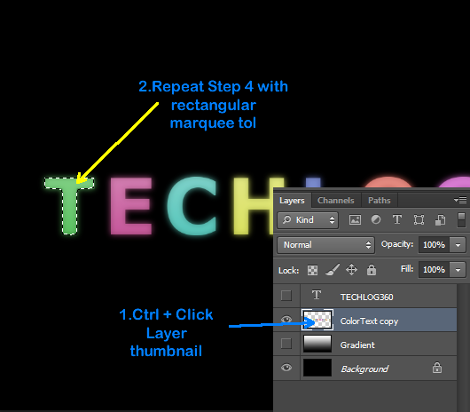
• Now focus on your merged text layer.Ctrl + Click” its thumbnail and do the same process with “Rectangular Marquee Tool” that we done in Step 4.And select your first letter.
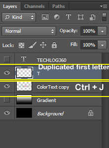
• After selection press “Ctrl + J” to duplicate our selected letter to new layer.

duplicate layers in photoshop

►Step 12


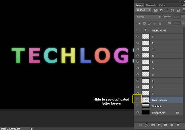
• Repeat the same process for each letter. Don’t forget to select the “ColorText Copy” layer after you press “Ctrl + J” each time.
• And when you done you will get duplicate copy of all letters in separate layer.
HideColorText Copy” layer to make duplicated layers visible.

hide layer in photoshop

►Step 13


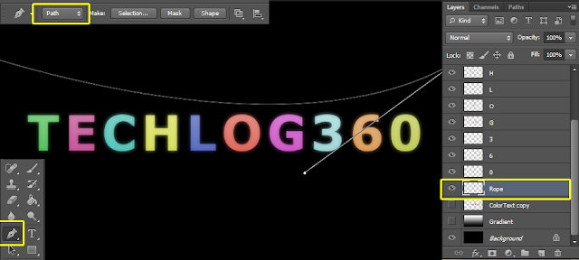
• Now create a new layer just above the “ColorText Copy“.And name it as “Rope“.
• Select “Pen Tool” and enable Tool Mode to “Path” and draw a path as shown below.

use pen tool to draw path in photoshop

►Step 14


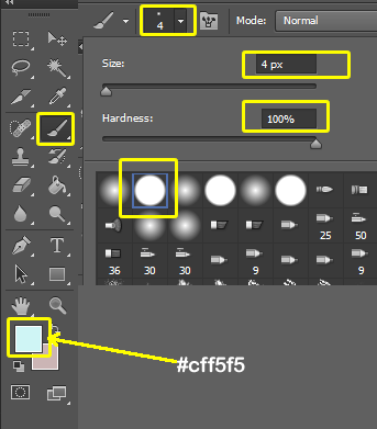
• Now set foreground color to “#cff5f5
• Then select “Brush Tool” and set “Brush Size:4px” and choose a hard round brush preset

use brush tool,adjust size of brush in photoshop

►Step 15


• After that again select “Pen Tool” and Right Click on the Path you created and choose “Stroke Path“.
• And in small box set “Tool:Brush“.
• And then hit “Enter” to Hide Path.

set stroke path tool in photoshop
set stroke path tool :brush in photoshop
path flled by brush tool in photoshop

►Step 16


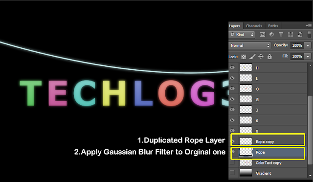
• Press “Ctrl + J” to duplicate “Rope” layer.
• Focus on original “Rope” layer and apply “Gaussian Blur” filter again or Press “Ctrl + F“.

duplicate and apply gaussian blur filter in photoshop

►Step 17


Arrange each letters on the Rope so that it looks like hanging.

resize,transform text in photoshop

►Step 18


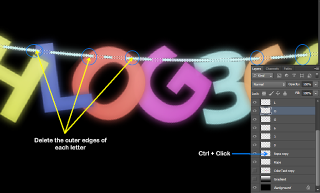
• Now first “Ctrl + Click” on “Rope Copy” layer thumbnail to select rope.
• And then select each letter layer.
• With the help of “Eraser Tool” erase the outer edges so that the letter looks like its really hang on the Rope
• And last press “Ctrl + D” to get rid of selection

use eraser tool in photoshop

►Step 19


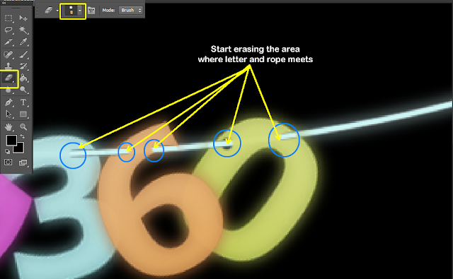
• Again select “Eraser Tool“.This time set its size as “8px” and choose hard round brush preset.
• And then select each letters and start erase parts where the Rope and the Letter meet.

use eraser tool in photoshop

And you will get

erase tool effect in photoshop

 ►Step 20


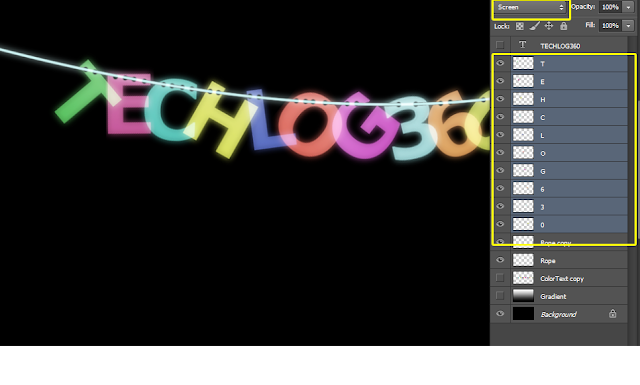
Now “Ctrl + Select” each letter layers and change its Blend Mode to “Screen“.
And we are done with our letters

set blend mode in photoshop

 ►Step 21


Now we are going to give some background effects.
• create a new layer above “Background” layer and name it as “NewBg“.
• Select “Brush Tool” with “Soft Round” Brush Preset and brush some random spots on your canvas.
• Then erase the a little bit of color around letters and  centre part

paint and use erase tool in photoshop

 ►Step 22


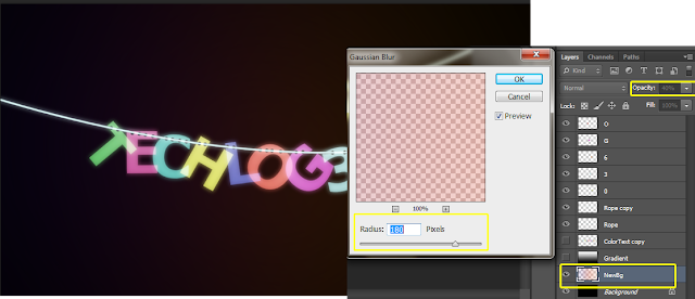
Then finally apply “Gaussian Blur” filter and also adjust opacity of “NewBg” layer

apply gaussian blur filter in photoshop

We are done…

 Final Image


final image of suspended text effect in photoshop

Two Responsive Pure CSS3 Image Slider For Your Website

image slider
 Nowadays all websites are responsive or mobile friendly.And its look cool when your website become compatible to alll devices.But sometimes its hard to find some contents that are suitable for a responsive design.And image slider is one of those.Today we are giving you two responsive  pure CSS3  image slider.Yes pure CSS3 not a bit of Jquery or Javascript code for transition effect.CSS3 styling make these image slider simple,clean and fast loading.

Responsive Pure CSS3 Smooth Image Slider

Responsive Pure CSS3 Smooth Slider
 Smooth Slider DEMO

• CSS Style


Copy below css style for smooth slider and paste it before <,/head> tag

<style>
#smooth-slider {
 text-align: center;
 margin: 0 auto;
 max-width: 640px;
 height:320px;
}
#smooth-slider input {
 display: none;
}
#smooth-slider label, a {
 color: #ef023f;
 cursor: pointer;
 text-decoration: none;
}
#smooth-slider label:hover {
 color: #ff0042 !important;
}
#slide1:checked ~ #smooth-slides .inner { margin-left:0; }
#slide2:checked ~ #smooth-slides .inner { margin-left:-100%; }
#slide3:checked ~ #smooth-slides .inner { margin-left:-200%; }
#slide4:checked ~ #smooth-slides .inner { margin-left:-300%; }
#slide5:checked ~ #smooth-slides .inner { margin-left:-400%; }
#overflow {
 width: 100%;
 overflow: hidden;
}
#smooth-slides article img {
 width: 100%;
}
#smooth-slides .inner {
 width: 500%;
 line-height: 0;
}
#smooth-slides article {
 width: 20%;
 float: left;
}
#controls {
 margin: -8% 0 0 84%;
 width: 15%;
 height: 50px;
}
#controls label { 
 display: none;
 width: 50px;
 height: 50px;
}
#active {
 margin: 23% 0 0;
 text-align: center;
}
#active label {
 -webkit-border-radius: 5px;
 -moz-border-radius: 5px;
 border-radius: 5px;
 display: inline-block;
 width: 10px;
 height: 10px;
 background: #f89e67;
}
#active label:hover {
 background: #ccc;
 border-color: #777 !important;
}
#controls label:hover {
 opacity: 0.8;
}
#slide1:checked ~ #controls label:nth-child(2), 
#slide2:checked ~ #controls label:nth-child(3), 
#slide3:checked ~ #controls label:nth-child(4), 
#slide4:checked ~ #controls label:nth-child(5), 
#slide5:checked ~ #controls label:nth-child(1) {
 background: url('http://4.bp.blogspot.com/-UIZu65eikkQ/VZ34eU1MJwI/AAAAAAAAAIY/vwJyNNu8Cdg/s1600/next.png') no-repeat;
 float: right;
 margin: 0 10px 0 0;
 display: block;
 background-color:#ef023f;
}
#slide1:checked ~ #controls label:nth-child(5),
#slide2:checked ~ #controls label:nth-child(1),
#slide3:checked ~ #controls label:nth-child(2),
#slide4:checked ~ #controls label:nth-child(3),
#slide5:checked ~ #controls label:nth-child(4) {
 background: url('http://2.bp.blogspot.com/-5CImAKrafOY/VZ34euMhR9I/AAAAAAAAAIc/5gpYLrn6Ns0/s1600/prev.png') no-repeat;
 float: left;
 margin: 0 0 0 -17px;
 display: block;
 background-color:#ef023f;
}
/* Description Box */
.details {
 width:10%;
    color: #FFFFFF;
    font-style: italic;
    line-height: 20px;
    margin-top: 260px;
    opacity: 0;
    position: absolute;
    text-align: left;
 overflow-wrap: break-word;
 -webkit-transform: translateZ(0);
 -webkit-transition: all 0.3s ease-out;
 -moz-transition: all 0.3s ease-out;
 -o-transition: all 0.3s ease-out;
 transition: all 0.3s ease-out;
}
.details h3 {
 color: #FFFFFF;
 margin: 0 0 5px;
 font-weight: normal;
 font-size: 16px;
 font-style: normal;
 background: none repeat scroll 0 0 #222222;
 padding: 5px;
}
/* slider Styling */
#smooth-slides {
 margin: 45px 0 0;
 padding: 1%;
 background: #222222;
 border:3px #222222 solid;
 max-width:640px;
 max-height:320px;
}
#smooth-slides article img {
width:100%;
height:320px;
}
/* Animation */
#smooth-slides .inner {
 -webkit-transform: translateZ(0);
 -webkit-transition: all 800ms cubic-bezier(0.770, 0.000, 0.175, 1.000); 
 -moz-transition: all 800ms cubic-bezier(0.770, 0.000, 0.175, 1.000); 
     -ms-transition: all 800ms cubic-bezier(0.770, 0.000, 0.175, 1.000); 
     -o-transition: all 800ms cubic-bezier(0.770, 0.000, 0.175, 1.000); 
     transition: all 800ms cubic-bezier(0.770, 0.000, 0.175, 1.000); /* easeInOutQuart */
     -webkit-transition-timing-function: cubic-bezier(0.770, 0.000, 0.175, 1.000); 
  -moz-transition-timing-function: cubic-bezier(0.770, 0.000, 0.175, 1.000); 
     -ms-transition-timing-function: cubic-bezier(0.770, 0.000, 0.175, 1.000); 
     -o-transition-timing-function: cubic-bezier(0.770, 0.000, 0.175, 1.000); 
        transition-timing-function: cubic-bezier(0.770, 0.000, 0.175, 1.000); /* easeInOutQuart */
}
#smooth-slider {
 -webkit-transform: translateZ(0);
 -webkit-transition: all 0.5s ease-out;
 -moz-transition: all 0.5s ease-out;
 -o-transition: all 0.5s ease-out;
 transition: all 0.5s ease-out;
}
#controls label{
 -webkit-transform: translateZ(0);
 -webkit-transition: opacity 0.2s ease-out;
 -moz-transition: opacity 0.2s ease-out;
 -o-transition: opacity 0.2s ease-out;
 transition: opacity 0.2s ease-out;
}
#slide1:checked ~ #smooth-slides article:nth-child(1) .details,
#slide2:checked ~ #smooth-slides article:nth-child(2) .details,
#slide3:checked ~ #smooth-slides article:nth-child(3) .details,
#slide4:checked ~ #smooth-slides article:nth-child(4) .details,
#slide5:checked ~ #smooth-slides article:nth-child(5) .details {
 opacity: 1;
 -webkit-transition: all 1s ease-out 0.6s;
 -moz-transition: all 1s ease-out 0.6s;
 -o-transition: all 1s ease-out 0.6s;
 transition: all 1s ease-out 0.6s;
}
/*Responsive Style */
@media screen and (max-width: 960px) {
#slide1:checked ~ #controls label:nth-child(5), #slide2:checked ~ #controls label:nth-child(1), #slide3:checked ~ #controls label:nth-child(2), #slide4:checked ~ #controls label:nth-child(3), #slide5:checked ~ #controls label:nth-child(4){
margin: 0 0 0 -50px;
float:left;
}
.details,.details h3{
color:transparent;
background-color:transparent;
}
}
@media screen and (max-width: 768px){
#slide1:checked ~ #controls label:nth-child(5), #slide2:checked ~ #controls label:nth-child(1), #slide3:checked ~ #controls label:nth-child(2), #slide4:checked ~ #controls label:nth-child(3), #slide5:checked ~ #controls label:nth-child(4){
margin: 0 0 0 -50px;
float:left;;
}
.details,.details h3{
color:transparent;
background-color:transparent;
}
}
@media screen and (max-width: 620px){
#slide1:checked ~ #controls label:nth-child(5), #slide2:checked ~ #controls label:nth-child(1), #slide3:checked ~ #controls label:nth-child(2), #slide4:checked ~ #controls label:nth-child(3), #slide5:checked ~ #controls label:nth-child(4){
margin: 0 0 0 -70px;
float:left;
}
.details,.details h3{
color:transparent;
background-color:transparent;
}
}
@media screen and (max-width: 420px){
#slide1:checked ~ #controls label:nth-child(5), #slide2:checked ~ #controls label:nth-child(1), #slide3:checked ~ #controls label:nth-child(2), #slide4:checked ~ #controls label:nth-child(3), #slide5:checked ~ #controls label:nth-child(4){
margin: 0 0 0 -80px;
float:left;
}
#smooth-slides article img {
height:280px;
}
.details,.details h3{
color:transparent;
background-color:transparent;
}
}
@media screen and (max-width: 320px){
#slide1:checked ~ #controls label:nth-child(5), #slide2:checked ~ #controls label:nth-child(1), #slide3:checked ~ #controls label:nth-child(2), #slide4:checked ~ #controls label:nth-child(3), #slide5:checked ~ #controls label:nth-child(4){
margin: 0 0 0 -80px;
float:left;
}
#smooth-slides article img {
height:220px;
}
.details,.details h3{
color:transparent;
background-color:transparent;
}
}
</style>


• HTML 


Here is the html code for smooth slider.Paste it where you want to display slider.

<div class="container">
<article id="smooth-slider">
<input checked="checked" name="smooth-slider" id="slide1" type="radio">
<input name="smooth-slider" id="slide2" type="radio">
<input name="smooth-slider" id="slide3" type="radio">
<input name="smooth-slider" id="slide4" type="radio">
<input name="smooth-slider" id="slide5" type="radio">
<div id="smooth-slides">
<div id="overflow">
<div class="inner">
 
<article>
<div class="details"><h3>DESCRIPTION 1</h3></div>
<a href="LINK 1"><img src="IMAGE 1"> </a></article>
 
 
<article>
<div class="details"><h3>DESCRIPTION 2</h3></div>
<a href="LINK 2"><img src="IMAGE 2"> </a></article>
            
<article>
<div class="details"><h3>DESCRIPTION 3</h3></div>
<a href="LINK 3"><img src="IMAGE 3"> </a></article>
                
 <article>
<div class="details"><h3>DESCRIPTION 4</h3></div>
<a href="LINK 4"><img src="IMAGE 4"> </a></article>
 
<article>
<div class="details"><h3>DESCRIPTION 5</h3></div>
<a href="LINK 5"><img src="IMAGE 5"> </a></article>
   
</div>
</div>
</div>
<div id="controls">
<label for="slide1"></label>
<label for="slide2"></label>
<label for="slide3"></label>
<label for="slide4"></label>
<label for="slide5"></label>
</div>
</article>
</div>


In above html code replace DESCRIPTION 1,LINK 1 and IMAGE 1 with description of first image,link that you want your image to redirect and image link respectively and do so with remaining 4.

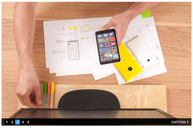
Responsive Pure CSS3 Tab Jump Image Slider

Responsive Pure CSS3 Tab Jump Slider
 Responsive Tab Jump Slider DEMO

•  CSS Style


Copy below css style for tab jump slider and paste it before <,/head> tag

<style>
/* Slider Container */
.slidertab {
margin:20px auto;
padding:0px 0px;
width:640px;
height:420px;
position:relative;
border: 5px #fff solid;
}
.slidertab li {
list-style:none;
margin:0px 0px;
padding:0px 0px;
}
/* Tab NAvigation */
.slidertab li input + label {
position:absolute;
bottom:5px;
left:10px;
z-index:999;
font:bold 11px/16px Arial,Sans-Serif;
background-color:black;
color:white;
padding:0px 0px;
width:16px;
text-align:center;
cursor:pointer;
}
.slidertab li:nth-child(2) label {left:28px;}
.slidertab li:nth-child(3) label {left:46px;}
.slidertab li:nth-child(4) label {left:64px;}
.slidertab li:nth-child(5) label {left:82px;}
/* Images */
.slidertab li img {
border:none;
outline:none;
position:absolute;
top:50%;
left:50%;
width:0px;
height:0px;
visibility:hidden;
opacity:0;
-webkit-transition:all 2s ease-in-out;
-moz-transition:all 2s ease-in-out;
-ms-transition:all 2s ease-in-out;
-o-transition:all 2s ease-in-out;
transition:all 2s ease-in-out;
-webkit-transform:rotate(0deg) scale(0);
-moz-transform:rotate(0deg) scale(0);
-ms-transform:rotate(0deg) scale(0);
-o-transform:rotate(0deg) scale(0);
transform:rotate(0deg) scale(0);
}
/* Captions */
.slidertab a {
text-decoration:none !important;
}
.slidertab li a span {
cursor:default;
display:block;
position:absolute;
right:0px;
bottom:0px;
left:0px;
background-color:rgba(0,0,0,0.8);
font:normal 11px/26px Arial,Sans-Serif;
color:white;
padding:0px 10px;
text-align:right;
opacity:0;
viibility:hidden;
-webkit-transition:all 2s ease-in-out;
-moz-transition:all 2s ease-in-out;
-ms-transition:all 2s ease-in-out;
-o-transition:all 2s ease-in-out;
transition:all 2s ease-in-out;
}
/* Active Tab Navigation */
.slidertab li input:checked + label {
background-color:#39f;
color:white;
}
/* Show the image with transition */
.slidertab li input:checked ~ img,
.slidertab li input:checked ~ a img {
top:0%;
left:0%;
width:640px;
height:420px;
visibility:visible;
-webkit-transform:rotate(720deg) scale(1);
-moz-transform:rotate(720deg) scale(1);
-ms-transform:rotate(720deg) scale(1);
-o-transform:rotate(720deg) scale(1);
transform:rotate(720deg) scale(1);
opacity:1;
z-index:99;
}
/* Show the caption with fade effect */
.slidertab li input:checked ~ a span {
opacity:1;
z-index:100;
}
/* Hide the radio */
.slidertab input{
display:none;
}
 /*Responsive Style */
@media screen and (max-width: 960px) {
.slidertab,.slidertab li input:checked ~ img,
.slidertab li input:checked ~ a img{
width: 100%;
height: 420px;
}
.slidertab li input + label {
position:absolute;
bottom:1px;
left:10px;
font: bold 16px/18px Arial,Sans-Serif;
}
.slidertab a {
visibility:hidden;
}
}
@media screen and (max-width: 768px){
.slidertab,.slidertab li input:checked ~ img,
.slidertab li input:checked ~ a img{
width: 100%;
height: 420px;
}
.slidertab li input + label {
position:absolute;
bottom:1px;
left:10px;
font: bold 16px/18px Arial,Sans-Serif;
}
.slidertab a {
visibility:hidden;
}
}
@media screen and (max-width: 620px){
.slidertab,.slidertab li input:checked ~ img,
.slidertab li input:checked ~ a img{
width: 100%;
height: 420px;
}
.slidertab li input + label {
position:absolute;
bottom:1px;
left:10px;
font: bold 16px/18px Arial,Sans-Serif;
}
.slidertab a {
visibility:hidden;
}
}
@media screen and (max-width: 420px){
.slidertab,.slidertab li input:checked ~ img,
.slidertab li input:checked ~ a img{
width: 100%;
height: 320px;
}
.slidertab li input + label {
position:absolute;
bottom:1px;
left:10px;
font: bold 16px/18px Arial,Sans-Serif;
}
.slidertab a {
visibility:hidden;
}
}
@media screen and (max-width: 320px){
.slidertab,.slidertab li input:checked ~ img,
.slidertab li input:checked ~ a img{
width: 100%;
height: 220px;
}
.slidertab li input + label {
position:absolute;
bottom:1px;
left:10px;
  font: bold 16px/18px Arial,Sans-Serif;
}
.slidertab a {
visibility:hidden;
}
}
</style>

• HTML


Here is the html code for tab jump slider.Paste it where you want to display slider.

<div align="center">
<ul class="slidertab">
<li>
<input type="radio" id="s1" name="num" checked="true" />
<label for="s1">1</label>
<a href="LINK 1"><img src="IMAGE 1" /><span>CAPTION 1</span></a>
</li>

<li>
<input type="radio" id="s2" name="num" />
<label for="s2">2</label>
<a href="LINK 2"><img src="IMAGE 2" /><span>CAPTION 2</span></a>
</li>

<li>
<input type="radio" id="s3" name="num" />
<label for="s3">3</label>
<a href="LINK 3"><img src="IMAGE 3" /><span>CAPTION 3</span></a>
</li>
 
<li>
<input type="radio" id="s4" name="num" />
<label for="s4">4</label>
<a href="LINK 4"><img src="IMAGE 4" /><span>CAPTION 4</span></a>
</li>

<li>
<input type="radio" id="s5" name="num" />
<label for="s5">5</label>
<a href="LINK 5"><img src="IMAGE 5" /><span>CAPTION 5</span></a>
</li>
</ul>
</div>

In above html code replace  LINK 1 , IMAGE 1 and CAPTION 1 with link that you want your image to redirect,image link  and description of first image, respectively and do so with remaining 4.

We hope you all like these pure CSS3 sliders.If you face any problem while insatlling this sliders to your website please comment below.
We will update this post with more CSS3 slides…..wait…….

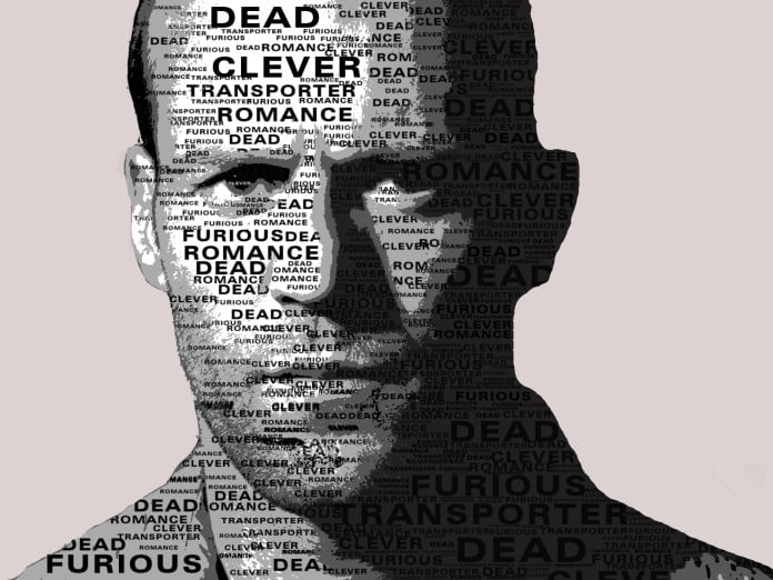
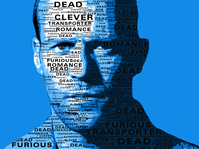
Create A Typographic Portrait Using Photoshop

Typographic portrait

Typography means playing with text.Today we are going to show you the simplest tutorial in typography.In this tutorial we are going to overlay some  of your favourite words over your image.This is the basic typography tutorial for beginners,In this tutorial we will also teach you how to create your own brushes.So lets start:


►Step 1


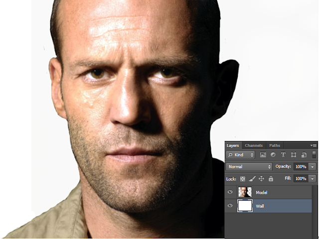
Open the image you like to give typographic effect.
I prefer  close up images will be better for this tutorial.Name the layer as “Model

1

►Step 2


Now only cut out the face part of the image or delete the part you didn’t want to give typographic effect.Then you will get an image something like below one.

3

►Step 3


Now create a new layer below the “Model” layer.And name it as “Wall“.Fill the “Wall” layer with “#ffffff” color.

4

►Step 4


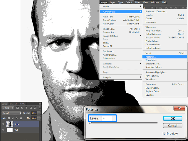
We are going to Desaturate the image file so select “Model” layer and press “Ctrl+Shift+U” or you can Desaturate it by going to “Image→Adjustments→Desaturate

5

►Step 5


Again go to “Image→Adjustments→Posterize” and set the value as “4“.

6

►Step 6


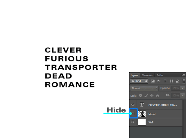
Hide
Model” layer for a while.
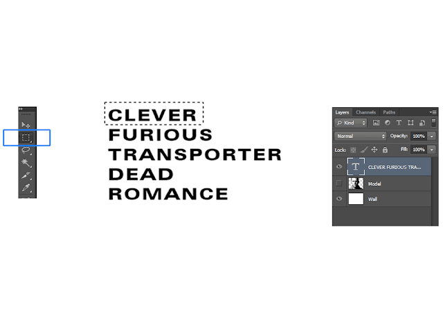
And using Type Tool with any font and color “#000000“,type some words that you want to appear on your image.

7

►Step 7


Now we are going to make some brushes.
Focus on your Text layer and with the help of “Rectangular Marquee Tool” select the first word.

8

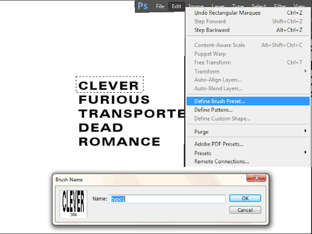
After selecting the first word go to “Edit→Define Brush Preset” and then name your new brush.

9

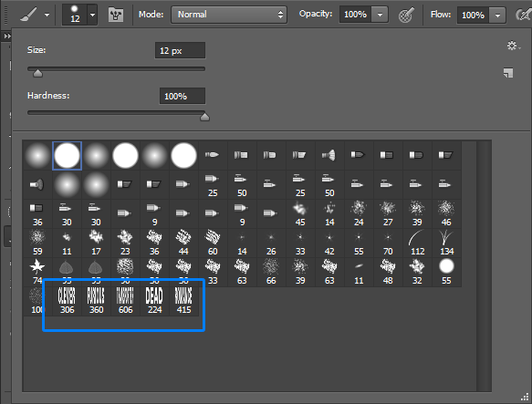
Similarly select other words and create brushes for them too.So here i created 5 different brushes for my 5 words.

9.1

►Step 8


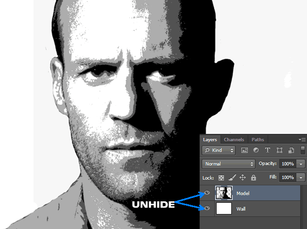
Now delete Text layer and UnhideModel” and “Wall” layers.

12

►Step 9


Now we are going to select each type of shades in “Model” layer.
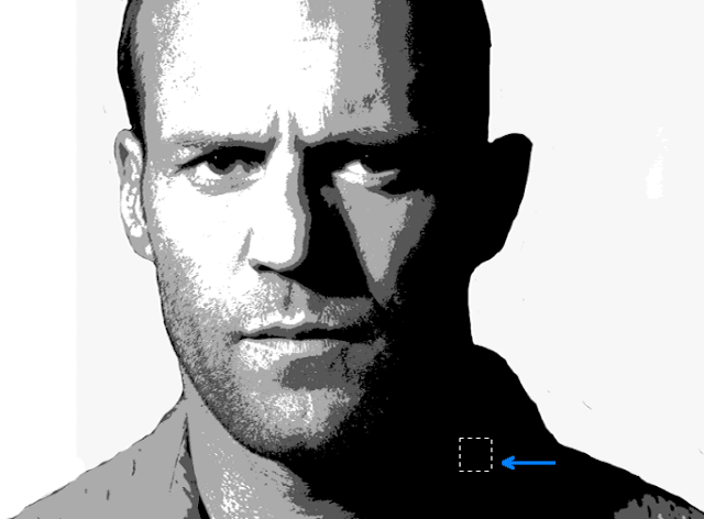
So with the help of “Rectangular Marquee Tool” we are going to select all the black color area in “Model” layer.
So first select a small portion of black color like below image.

13

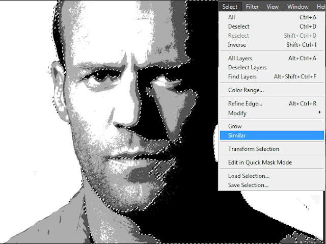
Then go to “Select→Similar” and you can see that all black colour region on “Model” layer are selected

14

►Step 10


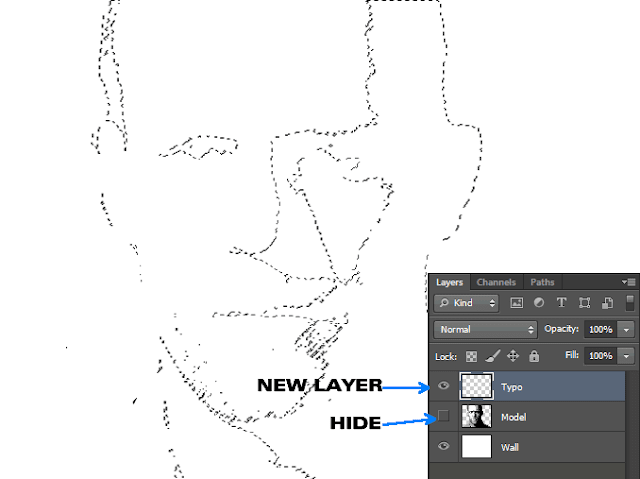
HideModel” layer leaving the selection loaded.
And create a new layer above “Model” layer and name it as “Typo“.And you will get something similar to below image.

15

►Step 11


And here we are going to use those brushes that we created in Step 7.
Focus on newly created layer-“Typo” and brush those words with different size on those selected area.
You can select the brush model and change its size by Right-click on any part of document.
And you will get something similar to below image.

16

►Step 12


Like that select a small part of another shade and and brush it.And brush the entire image with words.
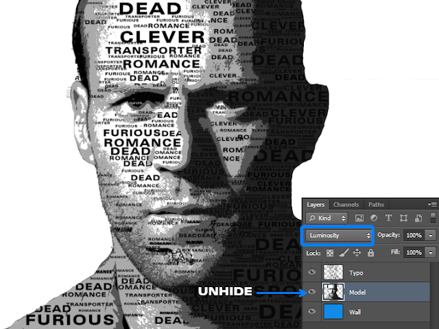
And now unhideModel” layer and adjust its colors and make blend mode as “Luminosity” and you will get an image similar to below one.

17

►Step 13


Just fill the “Wall” layer with different color.And you will get your typographic portrait like below one.

typographic

And we are done here.I hope you all like this tutorial.This is the most easiest method of overlaying text over your images.If you have any doubts comment below.
And also don’t forget to comment which type of tutorials you like to see from us.